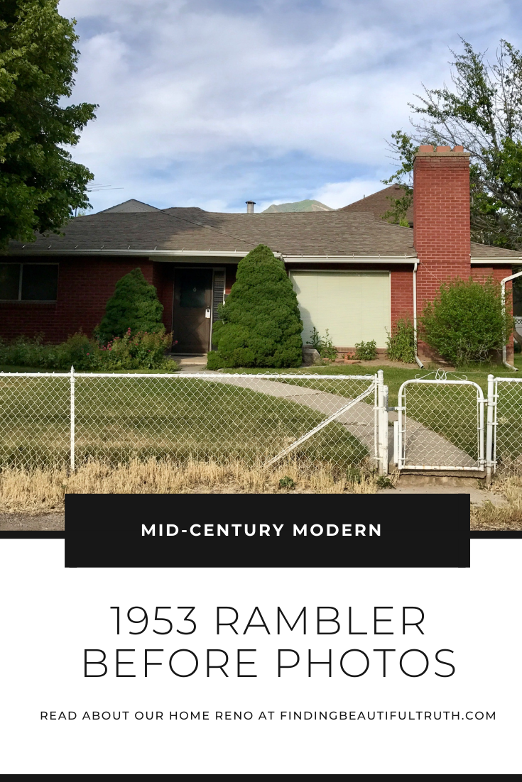
The renovation before photos . . .
After over a year on the job site, it’s easy to forget just how far we’ve come. Guys, we’ve come really far. Once we started demolition, we realized that we had to remove a lot more of the interior than we anticipated. Our first YouTube update paints a good picture. The workload, timeline + cost estimate quickly doubled. It turns out that this pretty common for homes built in the ’50s. Our home desperately needed more than a simple cosmetic update.
Things like structural work, plumbing and electrical had to be addressed. These are expensive fixes, but they gave us the opportunity to tweak the floor plan and truly make this OUR home. I’ve rounded up some renovation before photos of the biggest transformations. I’ve also included a brief description of what/how we made changes to the space. I’m so excited to finish renovating and move in. The side-by-side comparison photos are going to be dramatic.
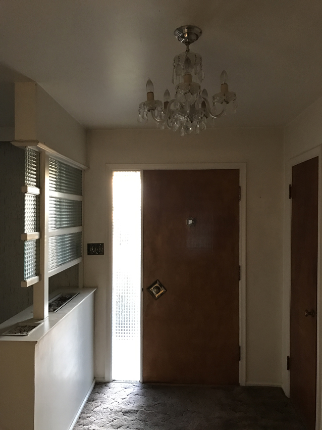
The Entry
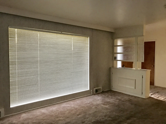
The entry was one of the features that originally drew me in. I loved the door hardware, the textured glass and the mid-century pony wall (that originally had a terrarium!). Unfortunately, there were some structural concerns that meant it had to go. Thankfully, our collaboration with Simpson Door Co. was the silver lining. Our new front door combines the old with the new (see the pictures here!). I love how the modern lines on our new front door mimic the design of the original pony wall.
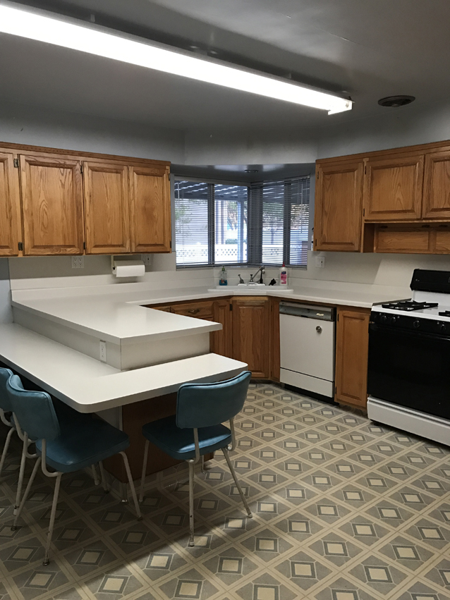
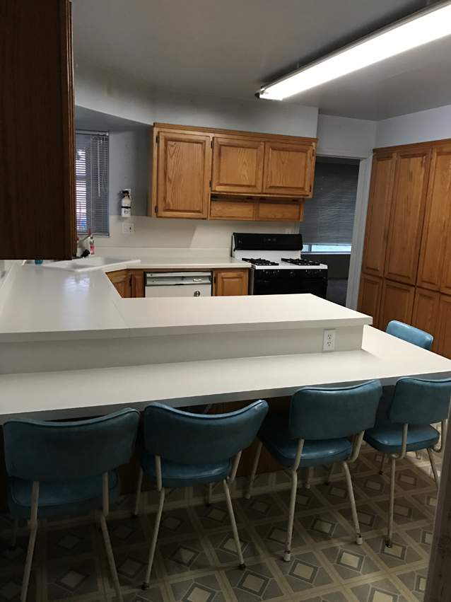
The Kitchen
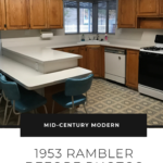
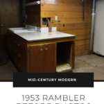
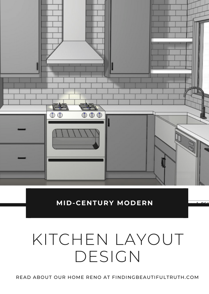
This is probably the biggest transformation of them all. We relocated the NEW kitchen to where the original dining room area was. This meant that everything had to go. We even removed the window you see below to reconstruct a solid exterior wall. And that wall with the upper + lower cabinetry? (See the second photo.) It went, too. This completely opened up the main floor living space. I shared a peek of our new kitchen layout in this post. I’m most excited about the oversized island and the large picture window above the sink. The window looks out into the yard so I can watch our girls play.
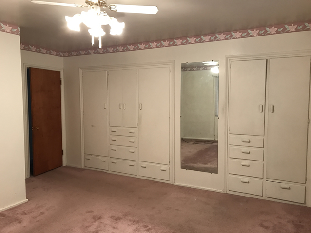
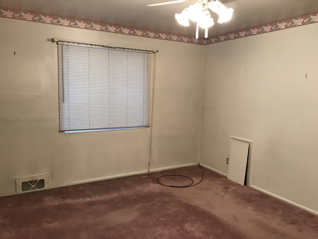
The Master Bedroom
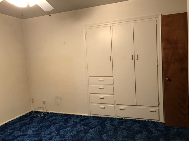
While I LOVED the original built-ins, they ended up needing extensive repair work. Instead, we decided to replace the existing wardrobe with a new floor to ceiling closet system. It’s going to be extremely functional, with places to organize, sort and store our stuff. Real talk: I can’t wait to unpack my clothes. We’ve been living season to season, unpacking what we need from boxes and repacking what we don’t need for the impending move. It feels like a vicious cycle of chaotic closet confusion.
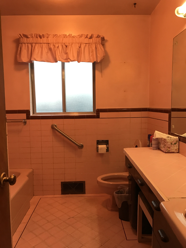
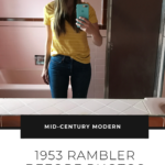
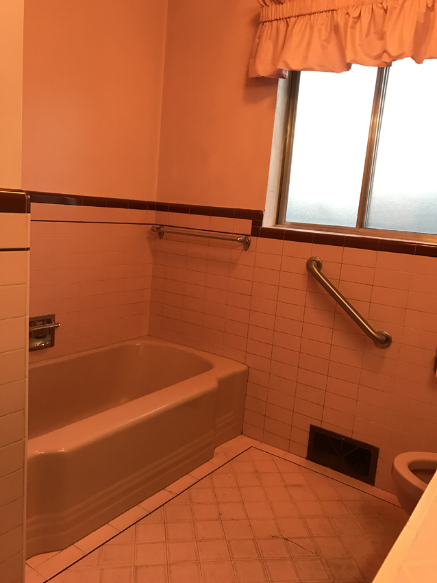
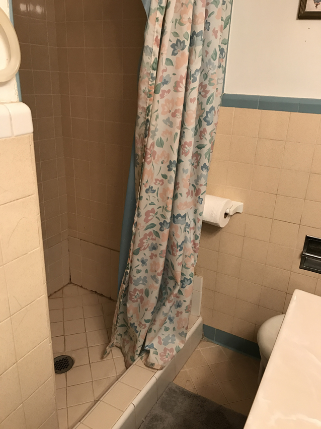
We also converted the pink bathroom (pictured below) into a master en suite. We closed the original door and created a new one kitty corner to the window in the second photo of the master bedroom.
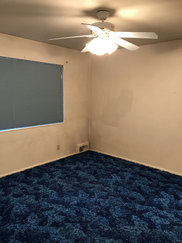
The Nursery
The blue shag carpet was definitely a pop of color, just the wrong color. Too bad we don’t have boys! Most of the updates in this room were cosmetic: new flooring, paint, lighting + the addition of a walk-in-closet. The nursery is right across from the master, so it’s ideal for the littlest one of our bunch. Plus, that picture window lets in a lot of natural light. Baby photo sessions are bound to happen.
The Main Floor Bathroom
Originally, this was the only bathroom on the main floor (we added a second). And yes, it was classic 1950s pink. To create a true master suite, we closed this bathroom off and opened it up to the master bedroom. That meant we couldn’t save as much of the existing decor as I hoped. BUT, we were able to save the original pink tub, toilet and sink! If you want them + are Utah local, I’m willing to sell. They’re in desperate need of a good home.
Some features in the new master en suite are a double vanity, marble tile, underfloor heating + a towel warmer. I’m really excited to enjoy a toasty towel during the winter months.
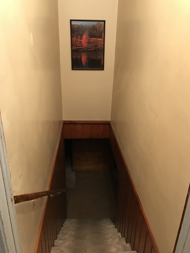
The Basement Stairs
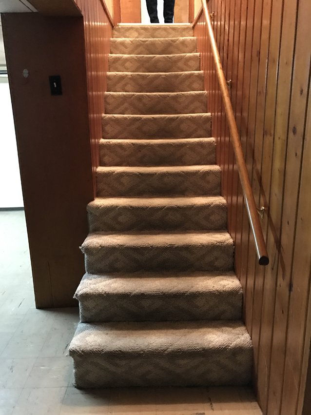
STEEP. The original stairway to the basement was so steep, and it was a far cry from kid-friendly. When we rearranged the basement layout, we reconfigured the stairway to feel a little more roomy. It will be a nice change, especially when we try to move furniture down the stars.
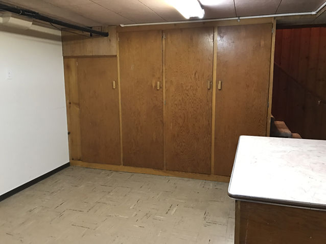
The Laundry Room
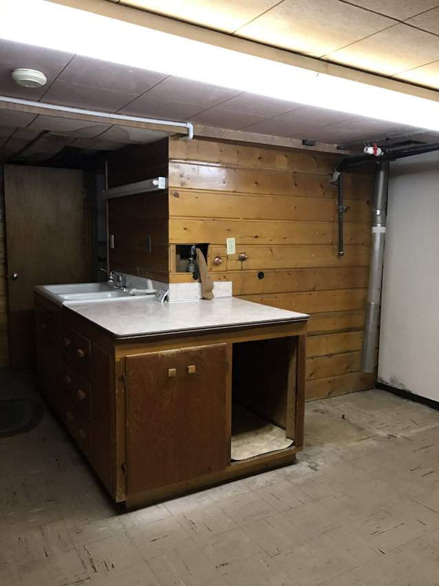
I’m happy to report that the new laundry room will be closed off from the rest of the basement. However, it’ll be pretty enough that I’m planning to include it in every new house tour. Think white flat-front cabinetry, butcher block counters, an oversized utility sink + hanging racks to dry clothes. I’m really looking forward to having a designated place to do the laundry and store things like cleaning supplies and extra linens. This room is going to come in handy.
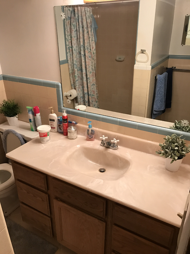
The Basement Bathroom
In the original basement floor plan, this was the lone bathroom for three bedrooms. The shower was tiny, and there wasn’t much leg room while using the loo. I wish we could have made it work. Needless to say, we had to start from scratch on this one. The new basement bathrooms (yep, there are two!) are functional + fashionable spaces that’ll make you want to get clean.
What’s the moral of these renovation before photos?
This house has great bones, and we can’t wait to move in. I’m literally chomping at the bit as we speak.



I seriously cannot wait until the after photos!!
You’re making great progress!! Cannot wait for the after photos!!