Bathroom design details . . .
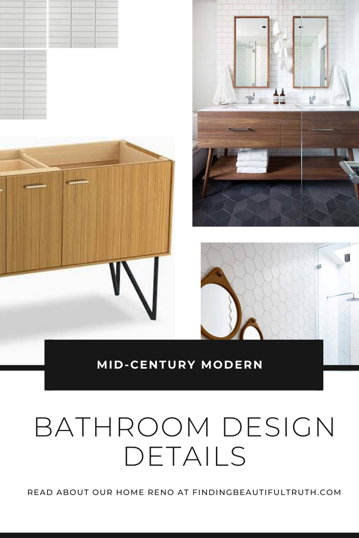
The original floor plan of the house didn’t have a en suite master bath. There was only one bathroom upstairs and one teeny-tiny bathroom downstairs. YIKES. So, after a few architectural tweaks and rearranged walls (more about that here), our new master bathroom was born. It’s a great space with a lot of natural light so we decided to play up Mid-Century geometric shapes, clean lines and cool tones. Here’s a look into our design process.
Initial Design Proposals
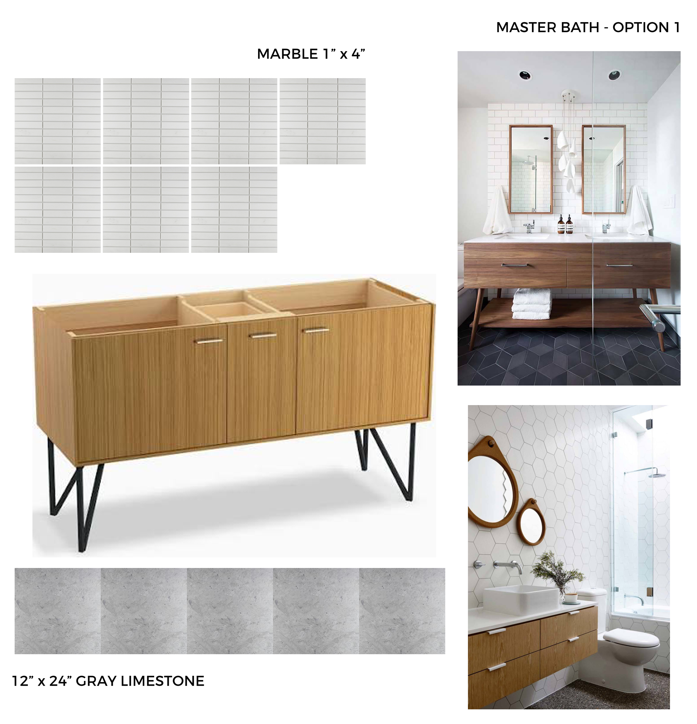
Option 1 – Stacked Marble Wall Tile, Gray Floor Tile, MCM Vanity + Matte Black Accents
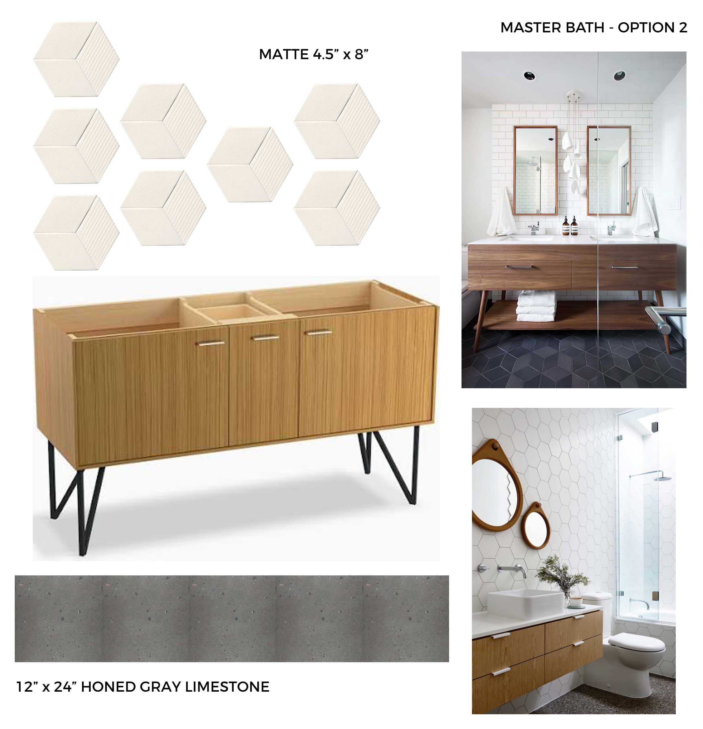
Option 2 – Matte White Hex Wall Tile, Charcoal Floor Tile, MCM Vanity + Matte Black Accents
Our Design Picks
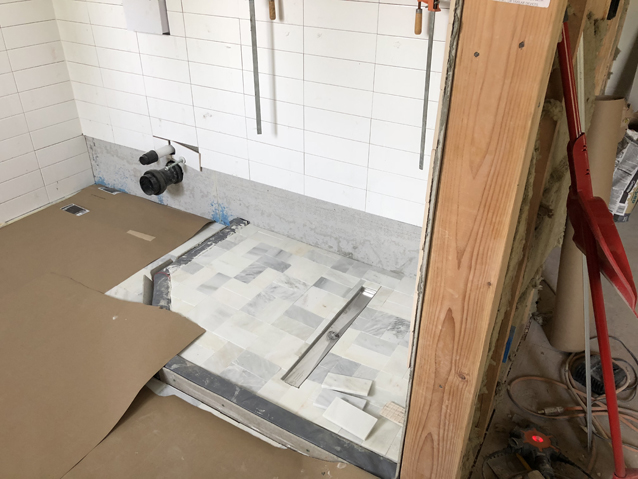
The initial design proposals (above) were a great place to start. We loved aspects of both options, and we decided to stick with the white, gray and matte black color scheme. Below you’ll find some of the products we went with for our master bath renovation as well as a progress photo of the marble basket weave + stacked floor to ceiling wall tile. I can’t wait to see it all come together. It’s going to be a beautiful mashup of MCM meets understated glam.
4×12 Stacked White Wall Tile, Floor to Ceiling with Light Gray Grout
3×6 Carrara Marble Floor Tile in 2×2 Basket Weave (similar style here)
Hardwired Towel Warmer via Amazon
Linear Shower Drain via Amazon
Double Vanity with Custom Concrete Sinks by Stanley Artisan Concrete
Matte Black Faucets + Shower Fixtures (tons of styles via Wayfair)
Underfloor Heating System via Amazon
Planning a few bathroom design details of your own? Have questions?
We’ve learned a lot through this renovation process, and we’re happy to share!



I love the mid century modern theme you’re going with for the bathrooms! It makes them look so pristine.