Basement design details . . .
After we walked through our house for the first time, we knew the basement would be an area we’d definitely need to work on. It was looked dark, felt dated and there was a lot of wasted space. Thankfully, we decided to hire an architect to help us tweak the original floor plan. We added + removed walls, created storage and designed a layout that actually added value to our home.
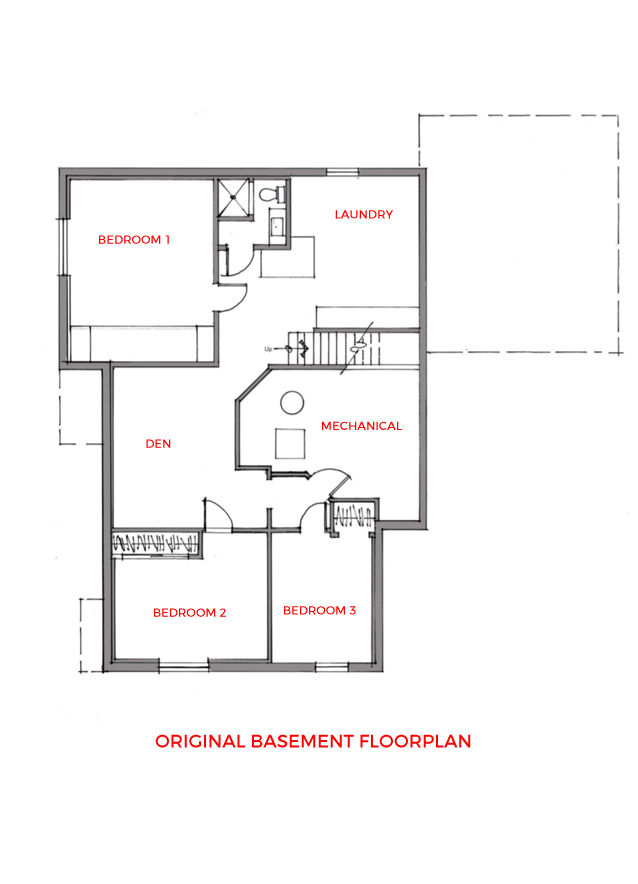
The Original Floor Plan
This is what the basement design + layout looked like when we bought the house.
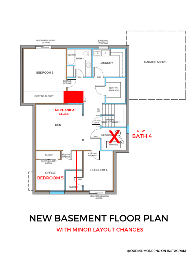
New Basement Floor Plan
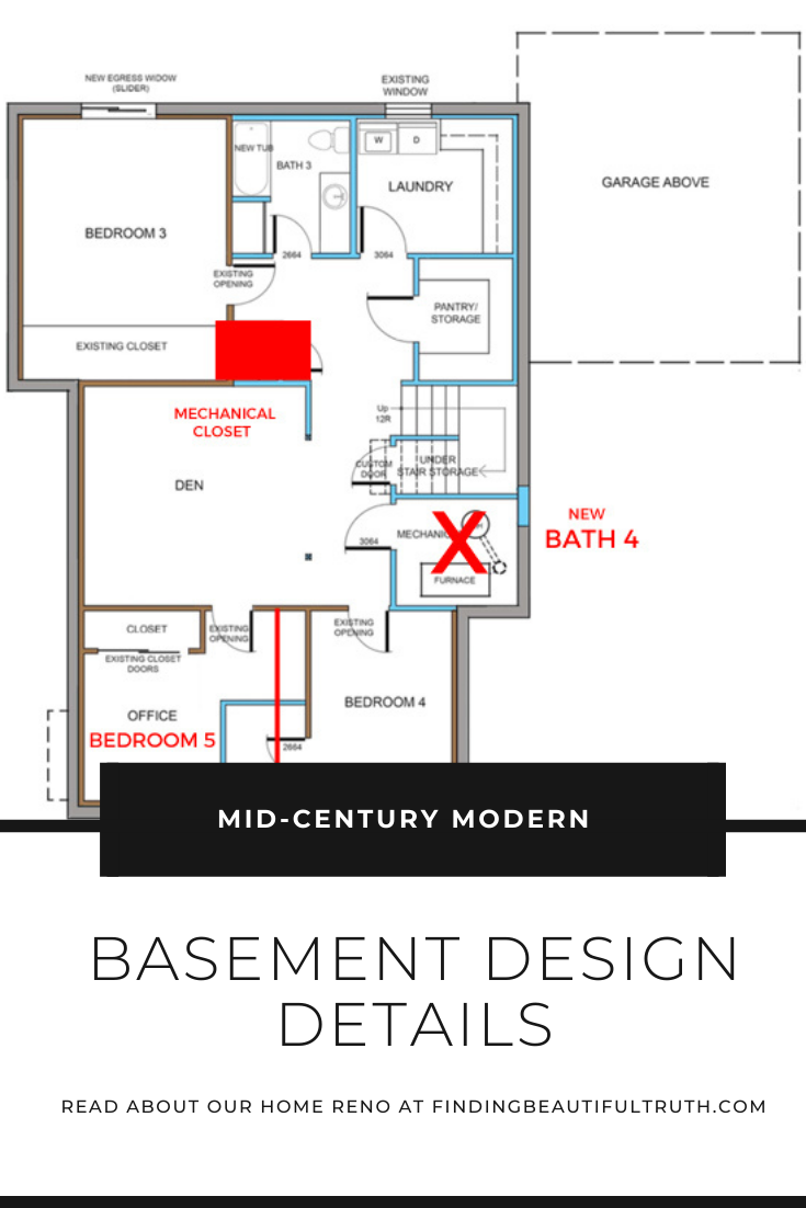
This is the initial floor plan proposal from our architect. I added some of the changes we made along the way–they’re in red.
Progress Photos
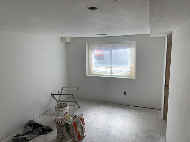
Below is Bath 3 and a bedroom. It’s still a construction zone so don’t mind the dust.
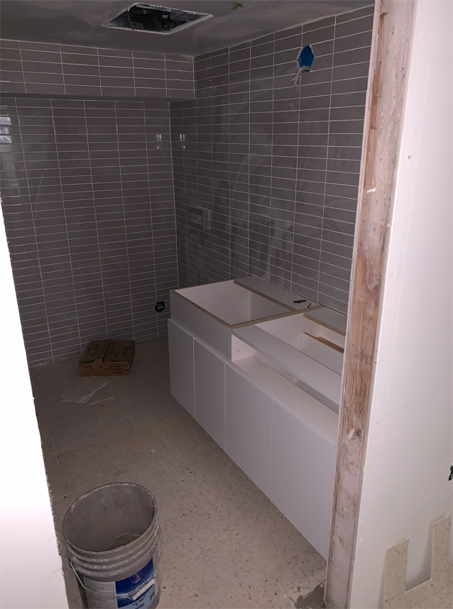
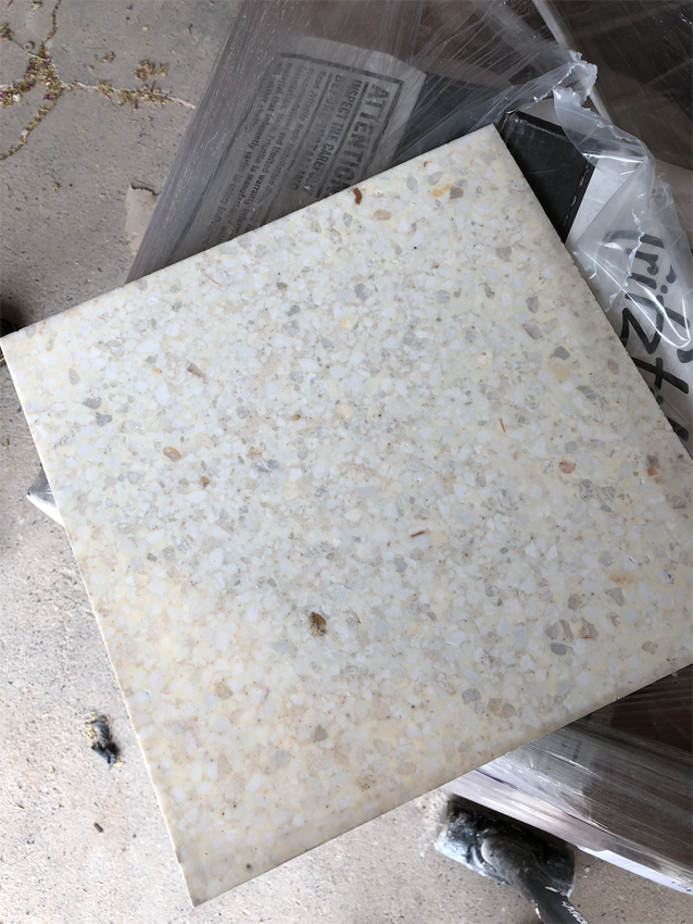
We knew we wanted to utilize the basement as actual living space (I didn’t want it to feel like a cave!) so brightening everything up was key. To do it, we added oversized windows in the bedrooms. This let in as much natural light as possible. Next, we chose a neutral flooring that would help reflect the light. I can’t believe how different the rooms feel now that the terrazzo tile (photo above) has gone it. The paint also helps to make the rooms feel lighter, brighter and larger. We went with a custom mix of white on both the walls + ceiling. I really do think we’re going to LOVE living, playing and working in this space.
Our Design Picks
Bath 3 Wall Tile – Cool Grey 2×8″ Rectangle in Stacked + Basket Weave Patterns
Moen Tub-Shower Fixtures via Amazon (multiple finishes here)
Terrazzo Floor Tile throughout Basement
Bath 4 Wall Tile – Cool Grey 6×6″ Square in Stacked Pattern
Custom Concrete Sinks in Bathrooms by Stanley Artisan Concrete
Sherwin-Williams Wall Paint in Custom Mix of White
Questions? Planning a renovation of your own?
We’ve learned a lot through this renovation process, and we’re happy to share!




Lookin good. Can’t wait for a move in date!